SQL Analysis Dashboard
Overview
The SQL Analysis Dashboard provides deep visibility into the performance and cost of your SQL workloads. While general cost dashboards track overall spending, this dashboard focuses on the execution layer. It helps you identify high-cost query signatures, monitor the health of your query runs, and pinpoint specific optimization opportunities. By understanding the relationship between your SQL code and resource consumption, you can improve efficiency across all your workspaces.
Key Features
Query-level cost tracking: See the Estimated Total Cost for specific query signatures to understand which code is most expensive.
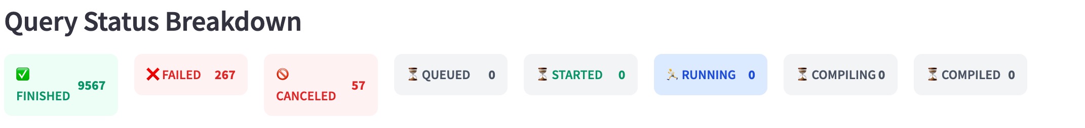
Operational health monitoring: Track Query Status (Success, Failed, or Canceled) to identify wasted spend on failed processes.
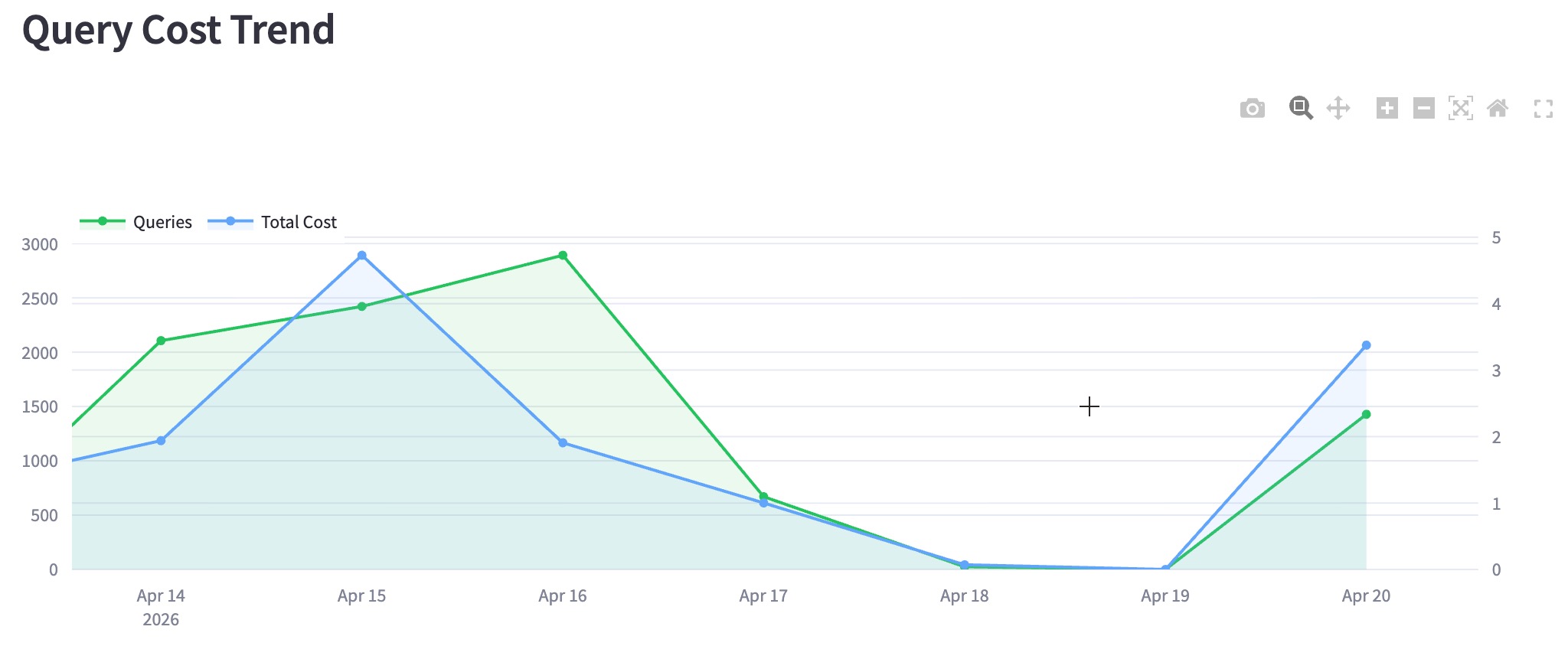
Trend analysis: Use visual charts to identify fluctuations in query volume and costs over specific time periods.
Signature-based analysis: Group similar queries together to see their cumulative impact on your budget and performance.
Top 50 optimization targets: Use a prioritized list of the most expensive queries to focus your tuning efforts where they have the most impact.
Example Use case
Imagine you are managing a shared Databricks environment and notice your daily DBUs are higher than budgeted. Here is how you would use the SQL Analysis Dashboard to find the root cause:
Spot the trend: You check the Query Cost Trend chart and see a sharp blue spike on a Tuesday. This tells you the cost increase wasn't a gradual crawl, but a specific event.
Filter by status: To see if this was "wasted" money, you look at the Query Status Breakdown. You notice a high percentage of FAILED queries on that same day.
Identify the signature: You scroll down to the Most Expensive Queries (Top 50 Signatures) table. You see a specific query signature at the top that has an unusually high Estimated Total Cost but a 0% success rate.
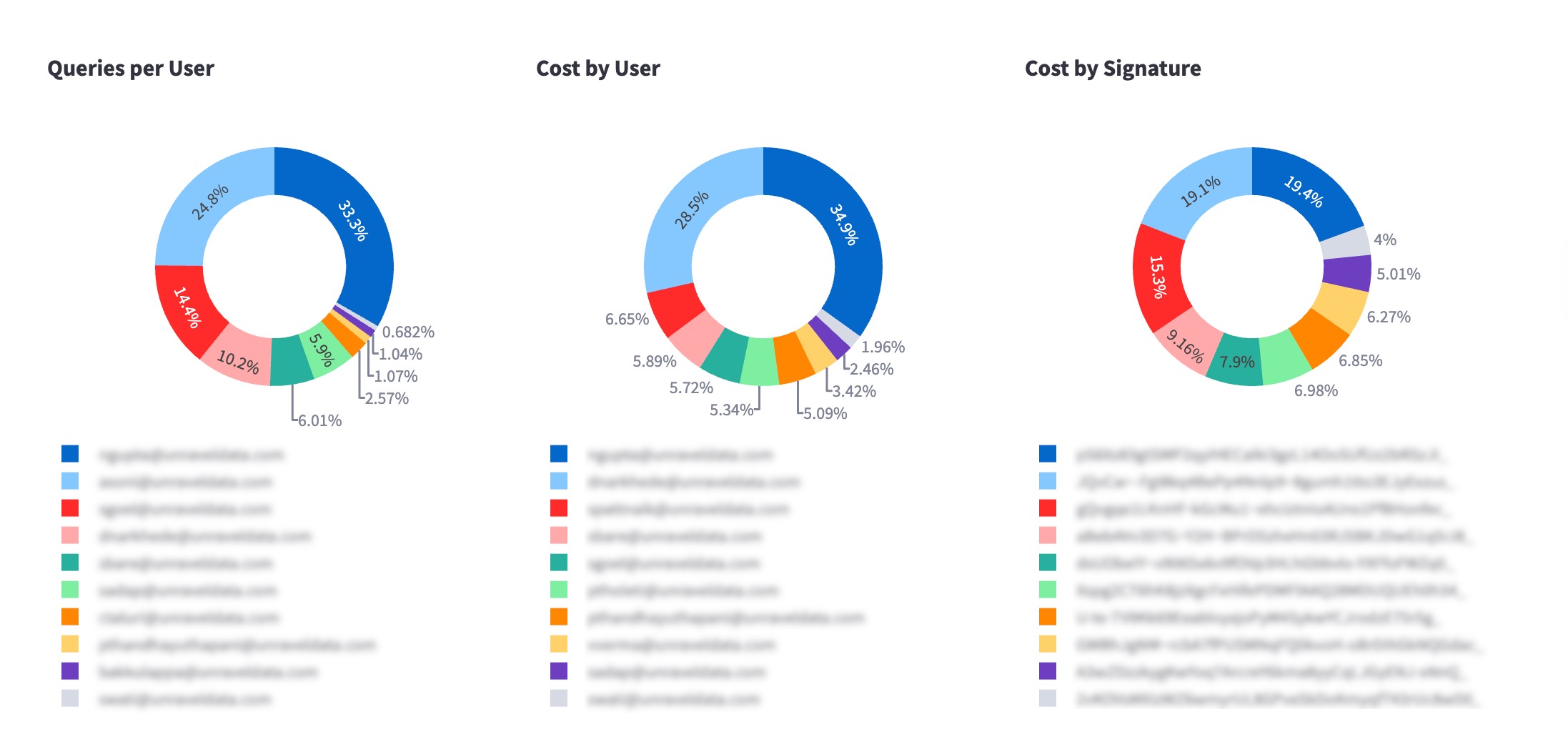
Pinpoint the user: By looking at the Queries per User donut chart, you identify exactly which service account or teammate is running that signature.
Take action: You reach out to the user to let them know their automated job is looping and failing, saving the department thousands in unnecessary costs.
Installing the app
For instructions on how to install and access the app, refer to Installing and accessing the app.
Configure the app
Follow these steps to patch and schedule the backend pipeline.
Open a terminal and go to the Unravel installation directory.
Navigate to the active version directory:
cd <unravel_installation_dir>/versions/<current_version>/appstore/app_manager/reports/sql_fetcher
Example:
/opt/unravel/versions/4.7.9.8-hotfix.10270/appstore/app_manager/reports/sql_fetcher
Replace the existing constants.py file with the updated version provided to you via email.
Restart the app store to apply the changes:
<unravel_installation_dir>/manager restart appstore
After you restart the service, verify that the pipeline is running correctly:
Run the following command to monitor the logs in real time:
tail -f <unravel_installation_dir>/logs/appstore_tasks.out
Check the log output for a "success" message to confirm the process completed.
Filters
Use filters to narrow the data displayed on the dashboard. When you apply a filter, all charts and tables update to show only the relevant information.
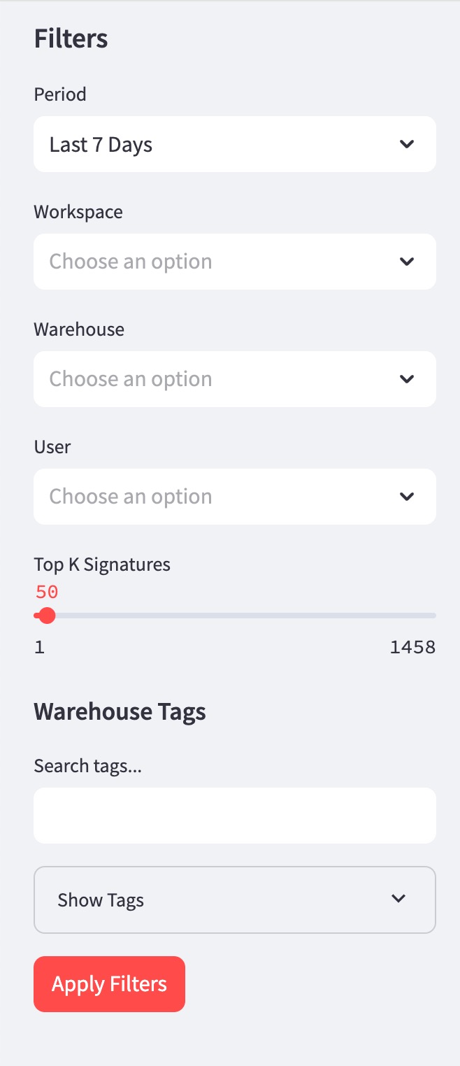
Workspace Name: Focus your analysis on a specific workspace or a group of workspaces.
Warehouse Tags: Search for and select specific metadata tags to see costs associated with particular projects or departments.
User Name: Filter the dashboard to see the activity and costs for a specific individual or service account.
Query Status: View data based on whether queries were SUCCESSFUL, FAILED, or CANCELED.
Date Range: Select a specific time period, such as the last 7 days or a custom range, to track trends over time.
Using the app
The SQL Analysis Dashboard is organized into three main sections to help you move from high-level trends to specific query details.
Summary metrics
At the top of the dashboard, you can see the overall impact of your SQL workloads through three key tiles:
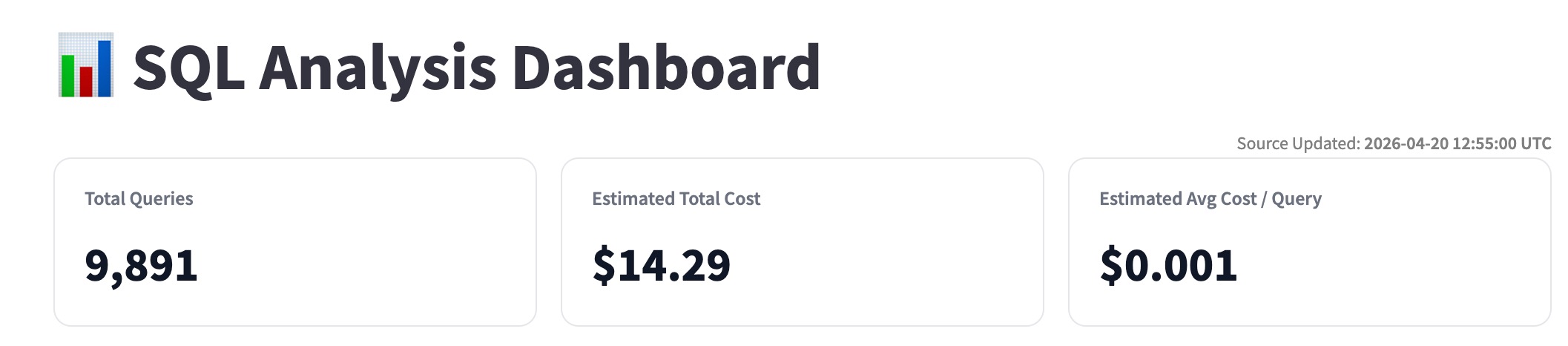
Total Queries: The total number of queries executed within your selected filters.
Estimated Total Cost: The calculated financial impact of those queries.
Estimated Avg Cost/Query: A benchmark for the efficiency of your typical SQL execution.
Visual analysis and trends
Use the charts in the middle of the dashboard to identify patterns and anomalies:
Query Status Breakdown: View a donut chart showing the percentage of SUCCESS, FAILED, and CANCELED queries. Use this to identify if you are spending budget on failed processes.
Query Cost Trend: Follow the line and bar graph to see how costs and query volumes fluctuate over time. Look for spikes that might indicate "noisy neighbor" behavior or unoptimized batch jobs.
User and Signature Distribution: Two donut charts show you the Cost by User and Cost by Signature. This helps you quickly see whether a single person or a specific query type is driving the majority of your costs.
Top 50 most expensive queries
This table provides the granular detail you need for optimization. It lists the top 50 query signatures ranked by cost. For each signature, you can see:
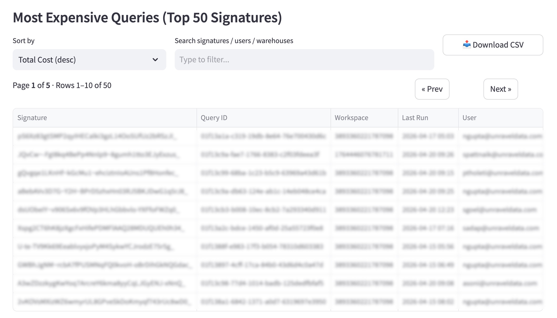
Estimated Total Cost: The cumulative spend for that signature.
Success Rate: How often this query completes successfully.
User Info: Which users are running the query most frequently.