Databricks cost anomaly detection app
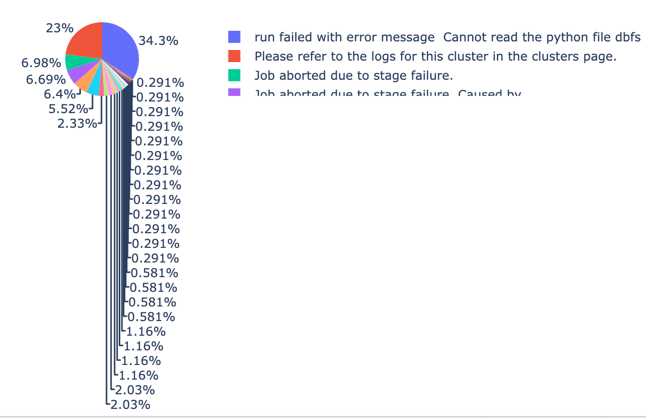
The Dbx Cost Anomaly application is designed to identify anomalies characterized by significant cost fluctuations, including detailed exceptional anomalies through its Error Analysis functionality.
Users can aggregate cost and exception count data on a daily or weekly interval basis, generating anomaly plots with time series graphs and comprehensive exception details. This app detects and notifies you about cost anomalies, showcasing them in trend graphs and allowing insights into cost breakdowns based on user, workspace, or tag.
Cost detection covers Job Cluster Analysis, All-purpose Cluster Analysis, and Error Analysis. You can configure the app to display trends daily or weekly and set notification channels to receive timely alerts for detected cost anomalies.
Benefits
Early expense detection: Detect unexpected cost anomalies and receive alerts to swiftly address irregularities, preventing budget overruns and ensuring efficient resource utilization.
Collaborative resolution: Collaborate effectively by sharing alerts with relevant teams through communication channels like Slack or email, fostering timely actions and cross-functional problem-solving.
Informed decision-making: Leverage anomaly insights to guide data-driven decisions for optimal resource allocation, enhancing performance while minimizing costs.
Long-term budget planning: Utilize trend analysis and reporting to monitor anomalies over time, enabling strategic long-term budget planning and alignment with financial goals.
Installing and opening Databricks cost anomaly detection app
Setting the Databricks cost anomaly detection app
In this section, we will see how to configure the settings of the Databricks cost anomaly detection app. The following settings can be configured:
Daily/weekly intervals to view the trend graphs.
Notification channels to receive alerts for cost anomalies.
Choose whether to suppress negative anomalies and specify tolerance values to suppress negative anomalies. Negative anomalies indicate points where the cost is abnormally low.
On the Unravel UI, from the upper-right corner, click
 and select App Store. The App Store page is displayed.
 Click the Dbx Cost Anomaly image to open the app, and then click the Settings tab.
In the Trend intervals section, select either the Daily or Weekly option. Accordingly, the trend graphs will display the data daily or weekly.
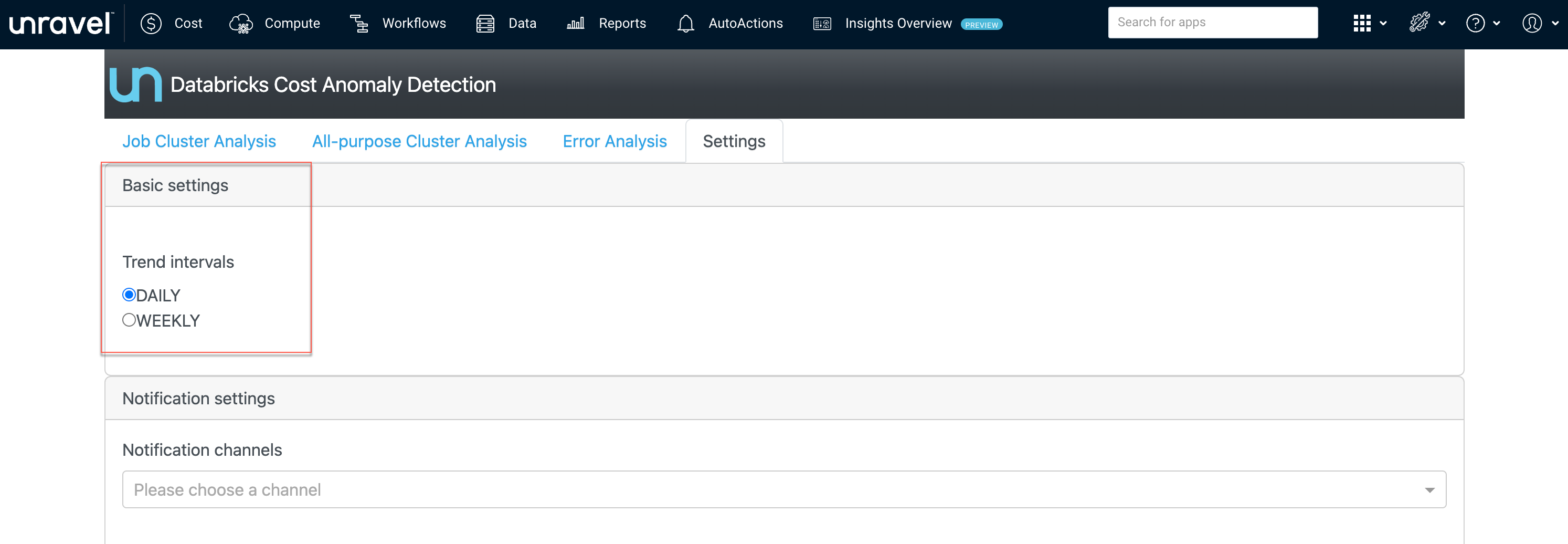
Click Save. You can view the corresponding changed settings from the Analysis tab.

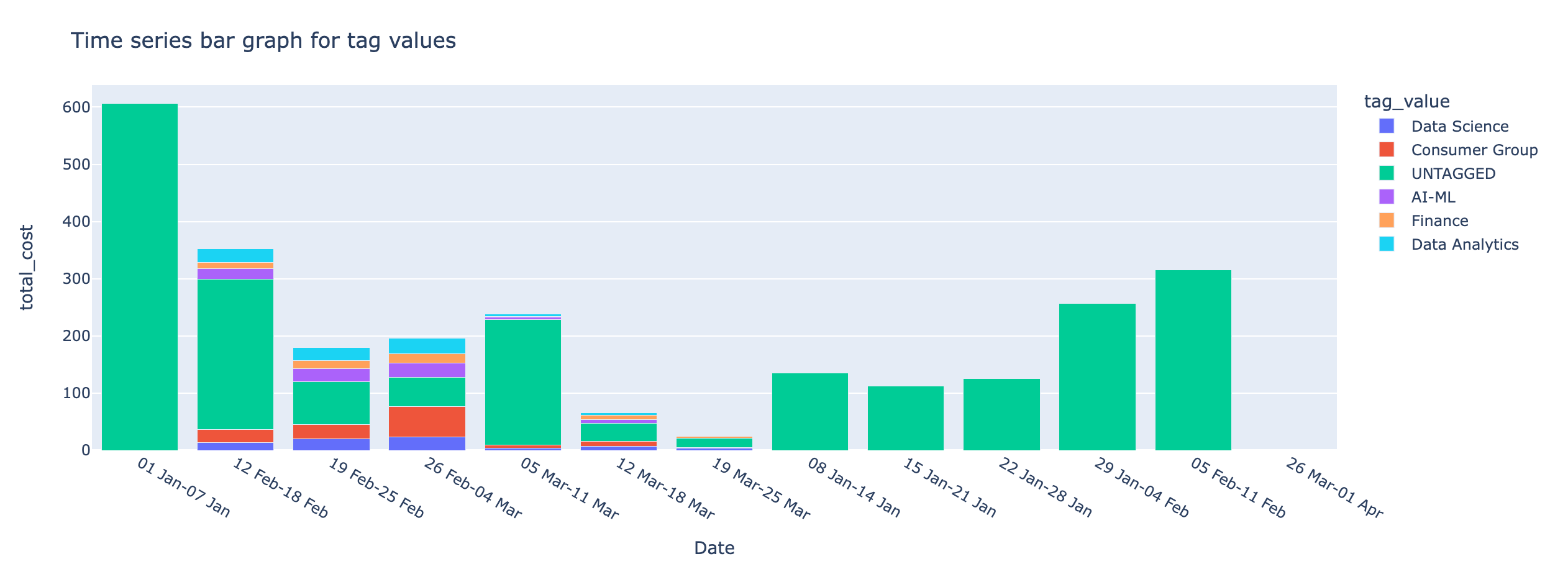
Daily and Weekly time series
On the Unravel UI, from the upper-right corner, click
 . and select App Store . The App Store page is displayed.
 Click the Dbx Cost Anomaly image to open the app, and then click the Settings tab.
In the Notifications settings section, select the channels where you want to send alerts when a cost anomaly is detected. The notifications that were created earlier are available for selection.

Click Save. Alerts are sent to the specified notification channels whenever a cost anomaly is detected. Here is an example of a notification of the cost anomaly detection sent to a Slack channel.

Negative anomalies indicate points where the cost is abnormally low. By default, the option to suppress negative anomalies is selected. You can specify the tolerance level for suppressing the negative cost anomalies.
On the Unravel UI, from the upper-right corner, click
 and select App Store. The App Store page is displayed.
 Click the Dbx Cost Anomaly image to open the app, and then click the Settings tab.
In the Anomaly settings section, do the following:
Check Suppress negative anomalies option if it is not checked already.
Use the Tolerance slider to adjust the tolerance level to suppress negative anomalies. This can be a value between 0 and 1.
0.95 is the recommended value.

Click Save.
Generating trends graphs for Databricks Cost Anomaly Detection
The Anomaly insight can be generated for Job Cluster Analysis, All-purpose Cluster Analysis, and Error Analysis.
On the Unravel UI, from the upper-right corner, click
 and select App Store. The App Store page is displayed.
 Click the Dbx Cost Anomaly image to open the app, and then click the Job Cluster Analysis tab.
From the Date Range calendars, select a period. Click on any two dates to choose the range.
From the Group by tag, select a tag to view the breakdown in the time series charts. The following cost and anomaly charts are shown along with the Anomaly insight.
Anomaly insight

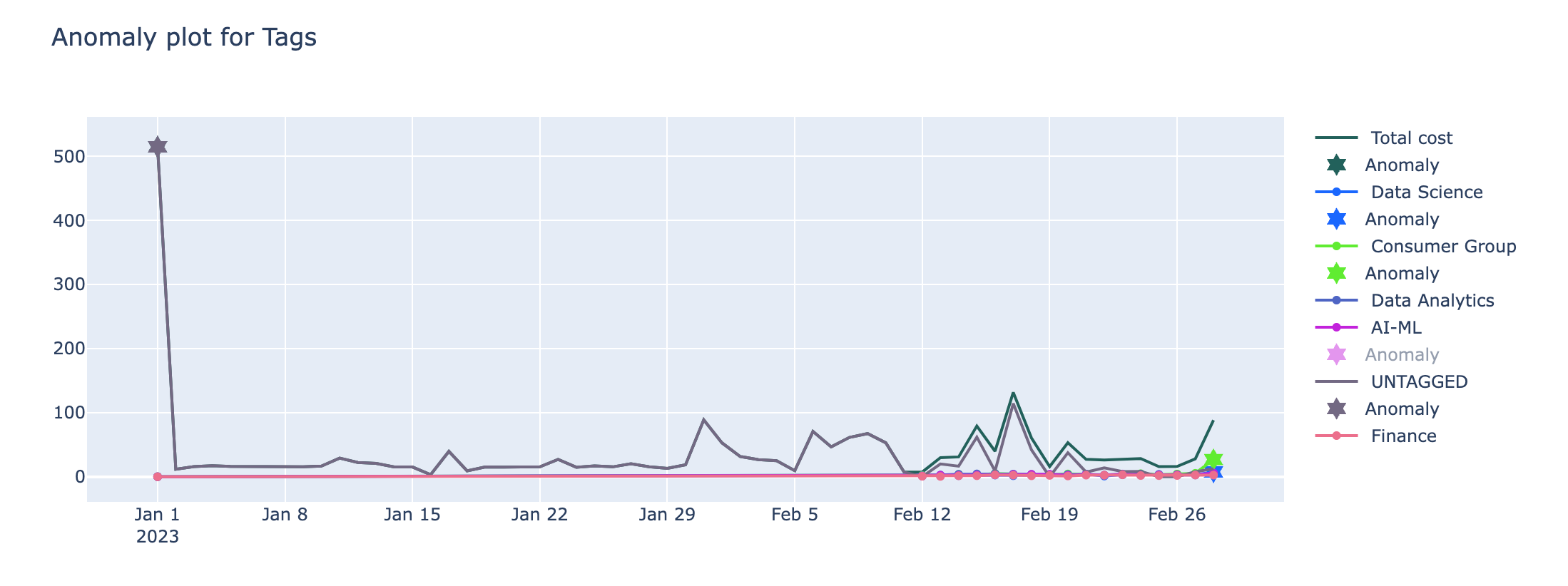
Time series bar graph with the cost incurred by the selected tag values
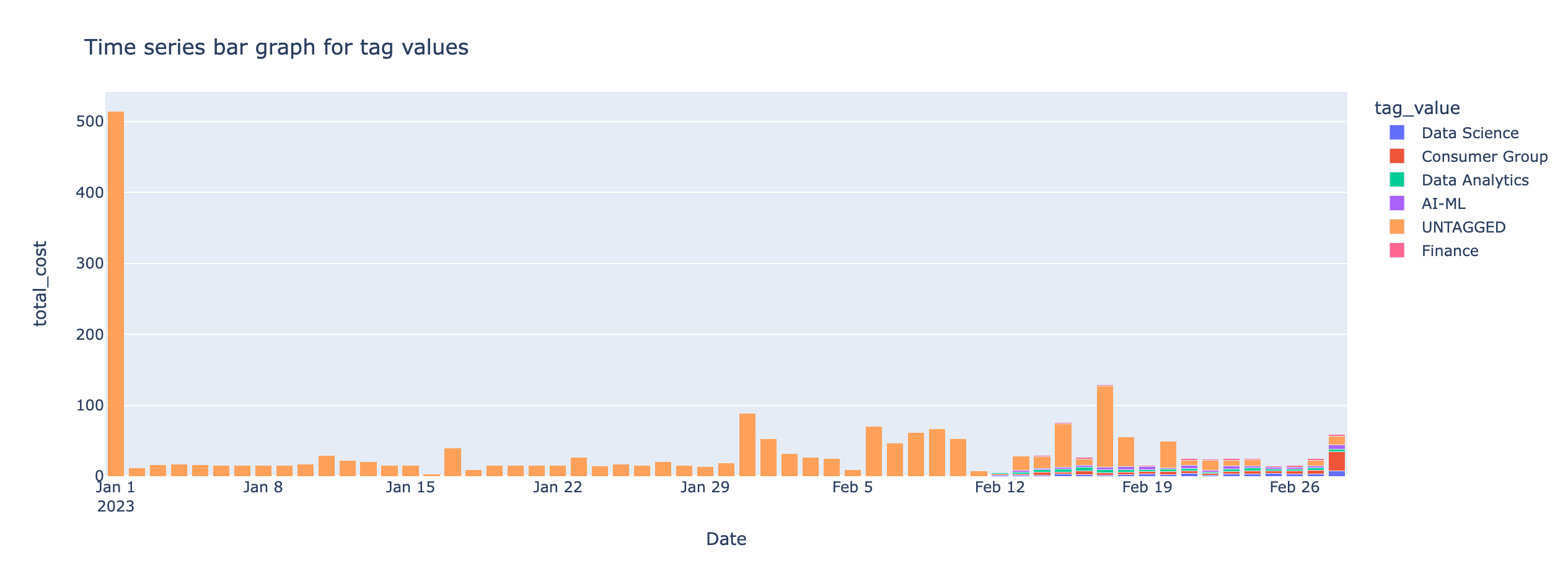
Time series line graph of the cost anomaly detected for the selected tags
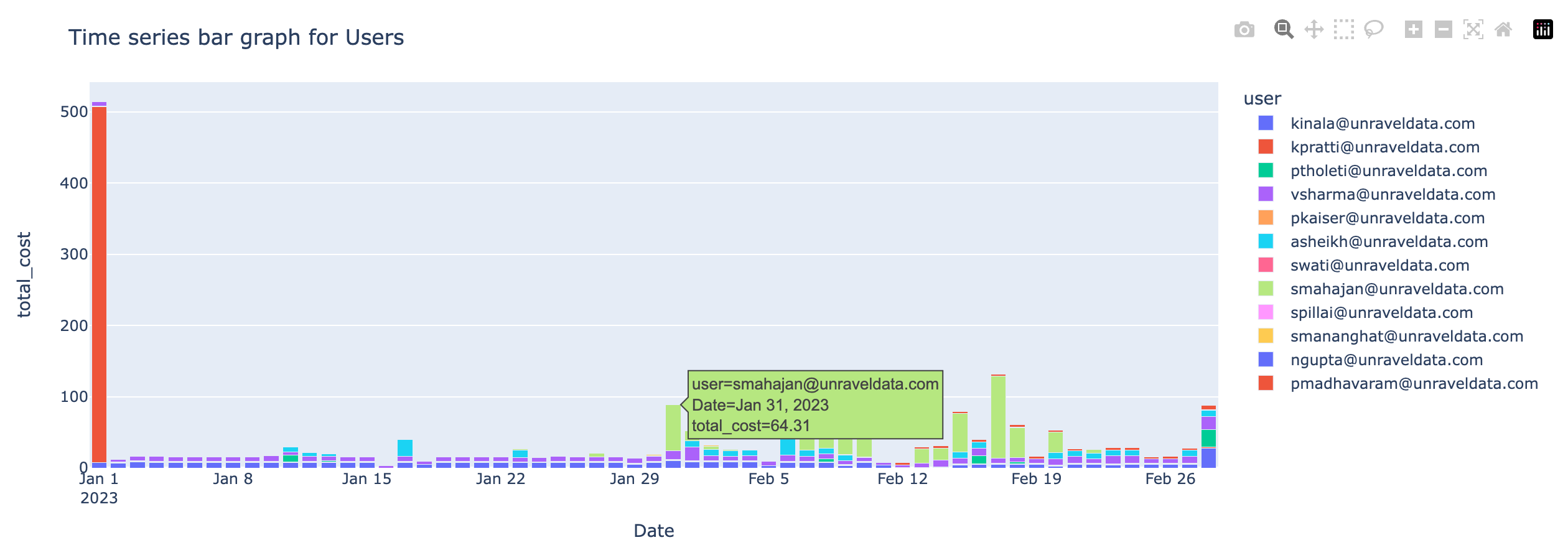
Time series bar graph with the cost incurred by users
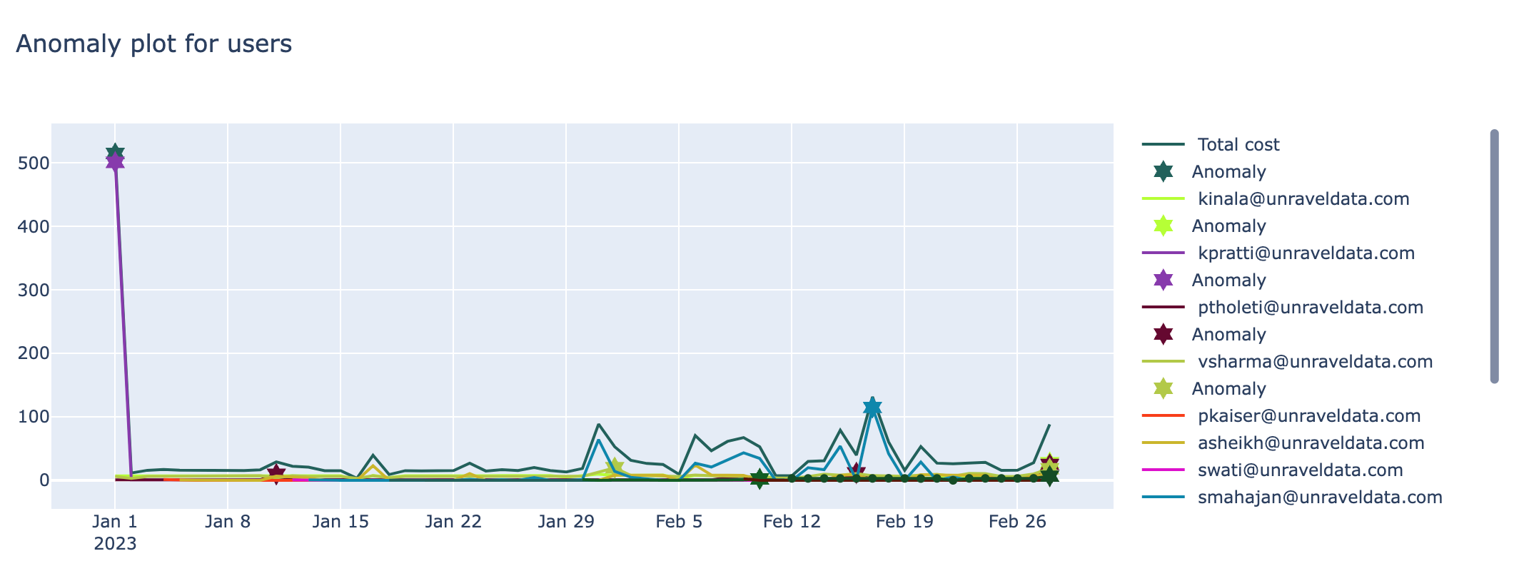
Time series line graph of the cost anomaly detected for the users
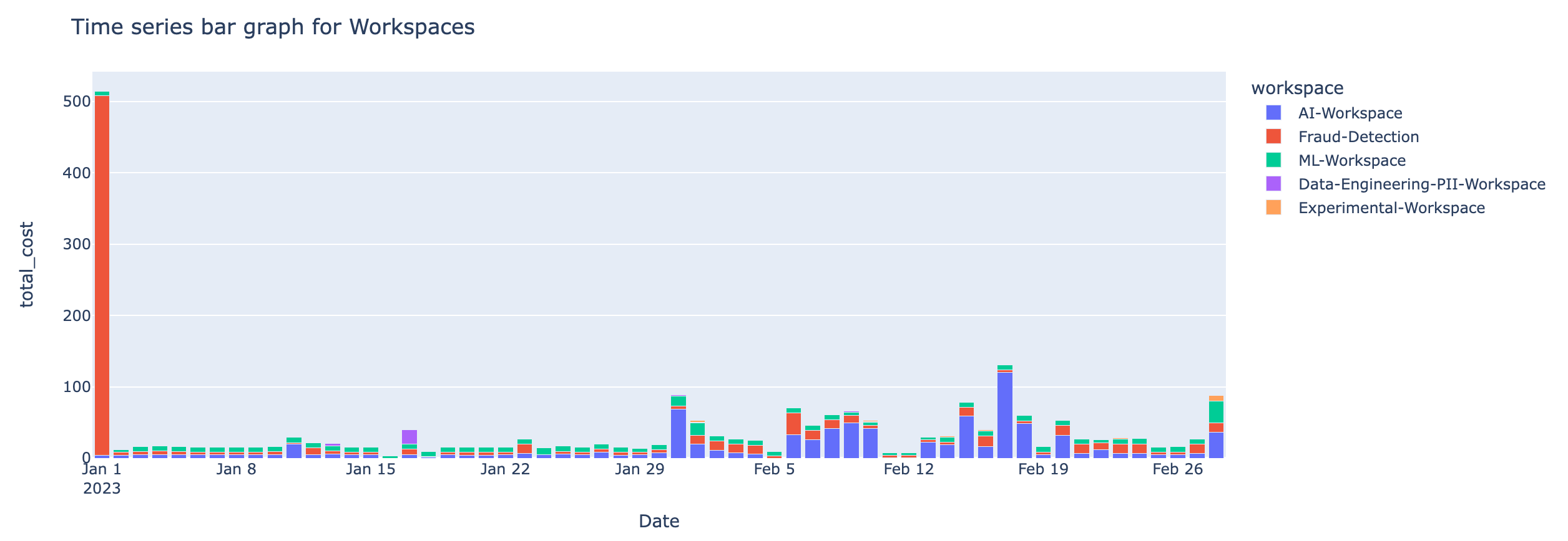
Time series bar graph with the cost incurred by workspaces
Time series line graph of the cost anomaly detected for the workspaces

On the Unravel UI, from the upper-right corner, click
 . The App Store page is displayed.
 Click the Dbx Cost Anomaly image to open the app, and then click the All-purpose Cluster Analysis tab.
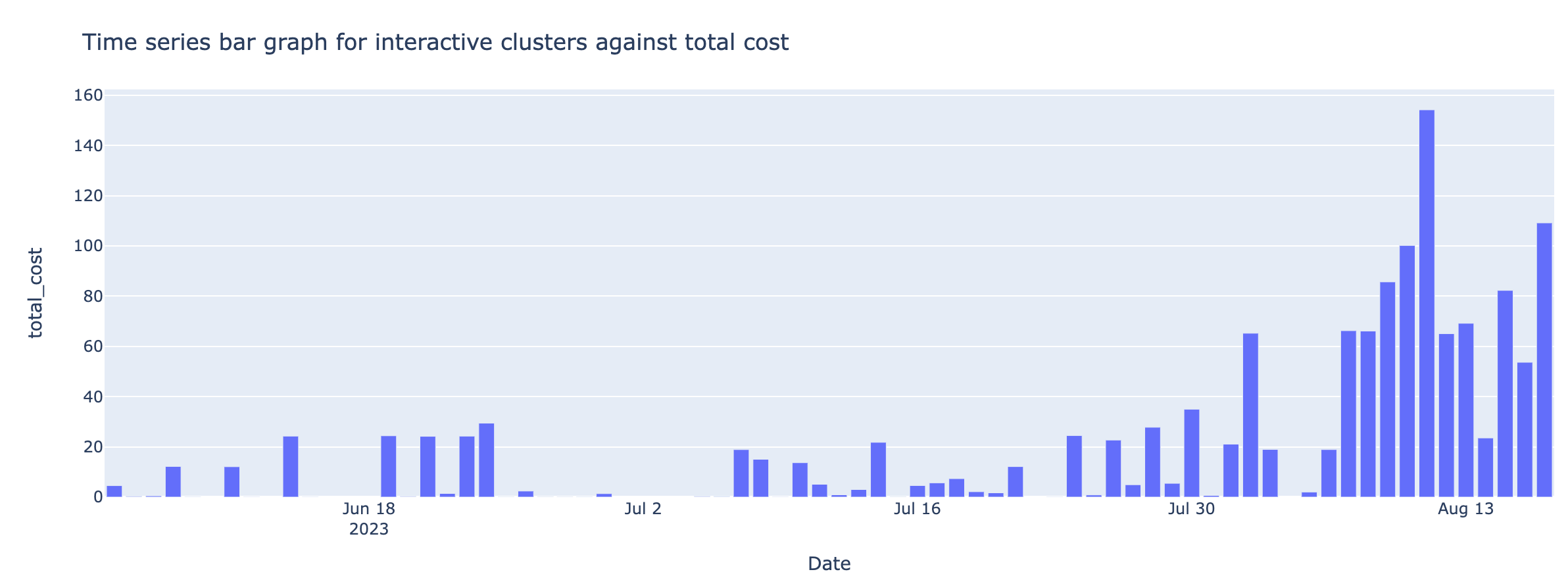
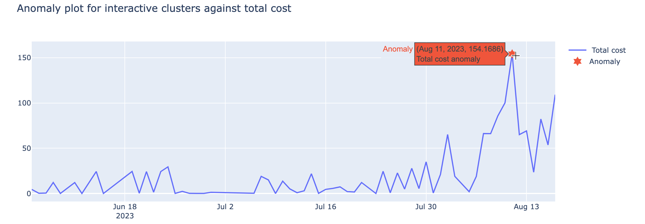
From the Date Range calendars, select a period. Click on any two dates to choose the range. The following cost and anomaly charts are shown along with the Anomaly insight.
Anomaly Insight

Time series bar graph for interactive clusters against total cost
Anomaly plot for interactive clusters against total cost
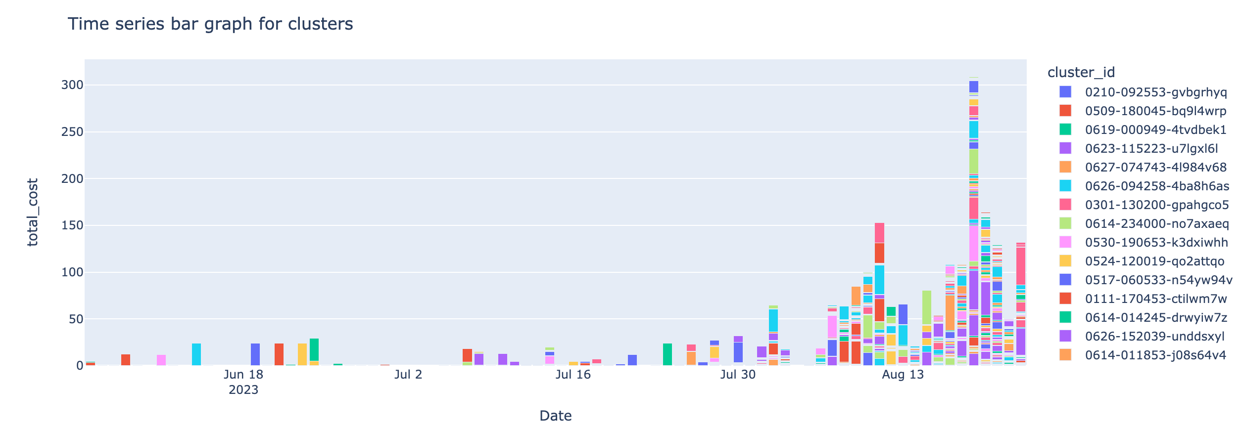
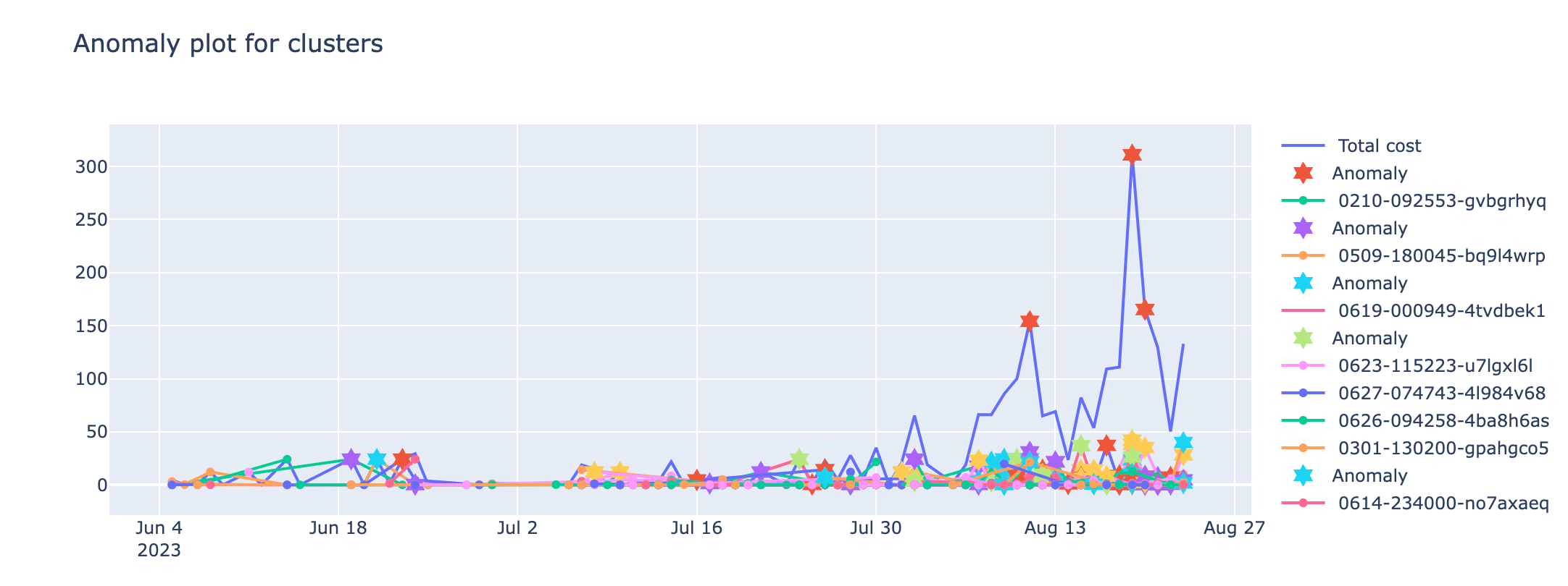
From the Interactive Cluster drop-down, select the required cluster. The following charts for Interactive Clusters' specific costs are displayed.
Time series bar graph for clusters
Anomaly plot for clusters
On the Unravel UI, from the upper-right corner, click
 and select App Store . The App Store page is displayed.
 Click the Dbx Cost Anomaly image to open the app, and then click the Error Analysis tab.
From the Date Range calendars, select a period. Select any two dates to choose the range.
From the Group by tag, select a tag to view the breakdown in the time series charts. The following anomalies and error trends charts are shown along with the Anomaly insight.
Anomaly Insight

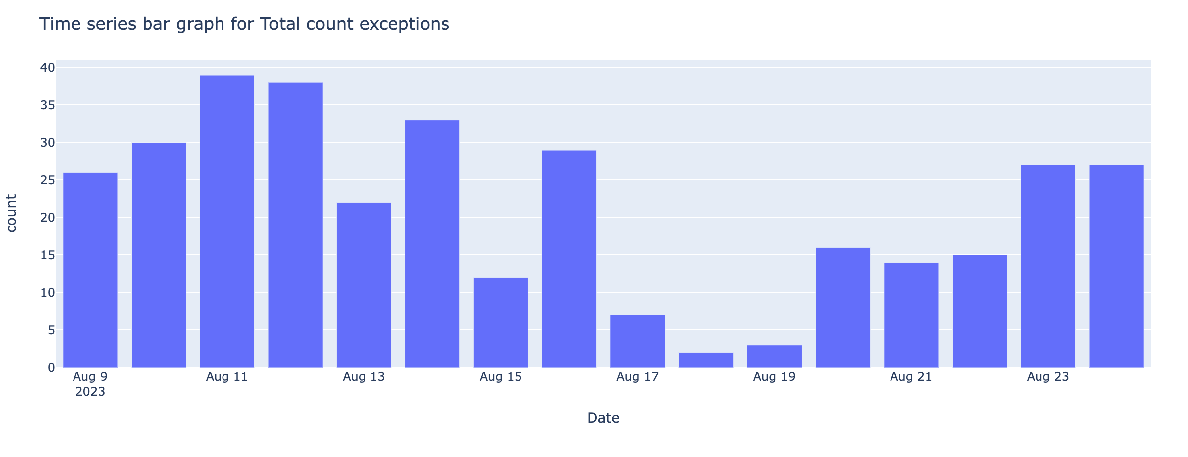
Time series bar graph for total count exceptions
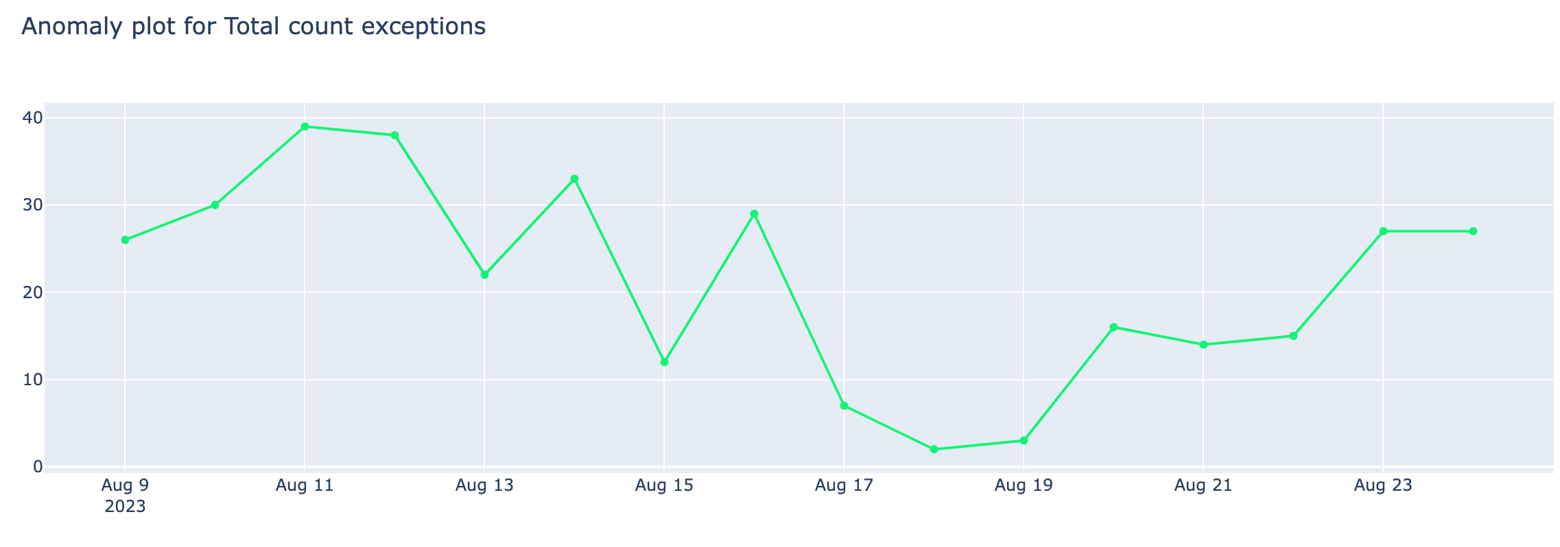
Anomaly plot for total count exceptions
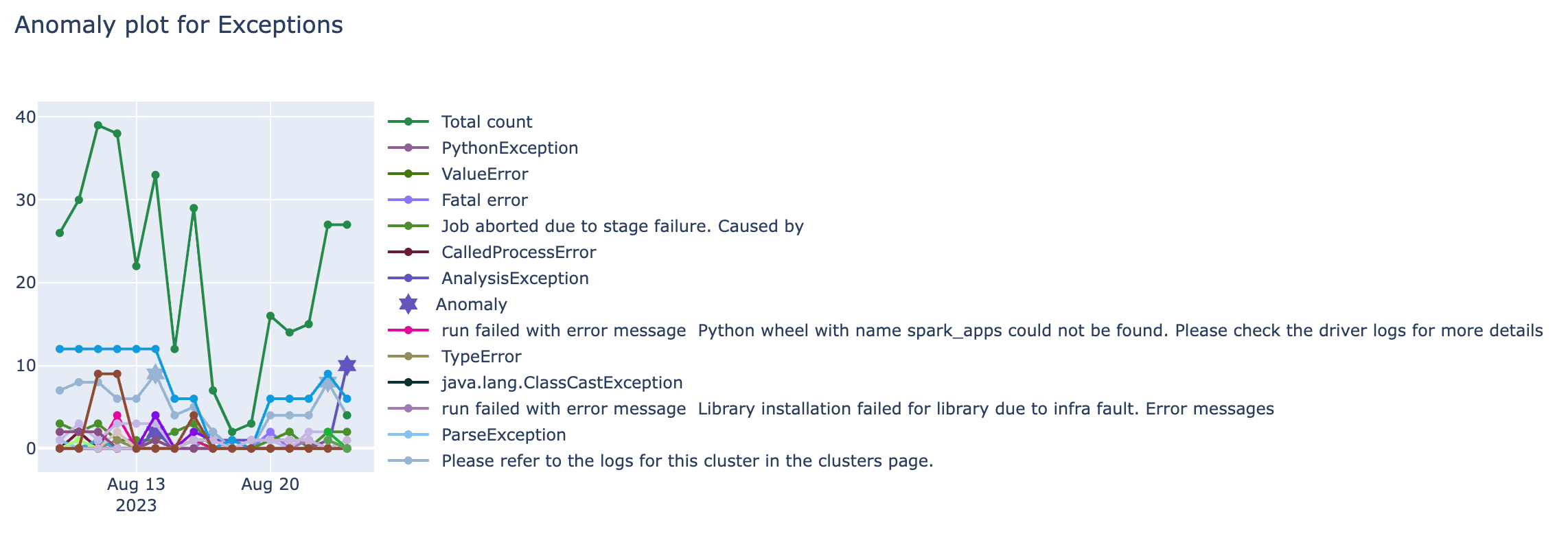
Anomaly plot for exceptions
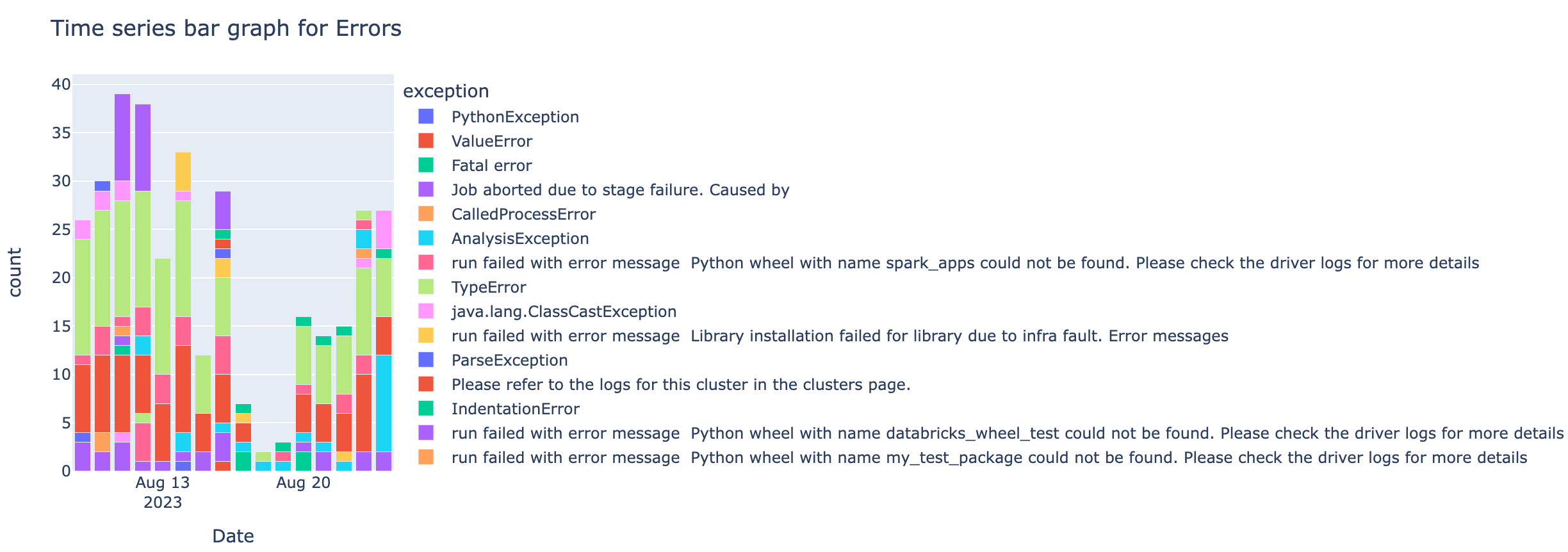
Time series bar graph for errors
Anomaly plot for error trends
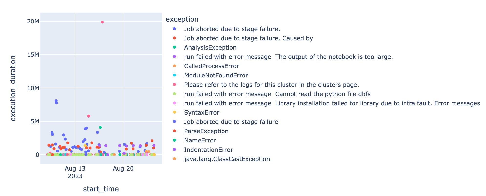
Anomaly chart for error messages
