Common UI/UX features
Currently under construction.
When you can select a cluster to use a pull-down window, 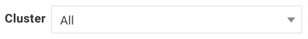 , is in the tabs title bar. The pulldown lists all the available clusters
If you can select a date range, there is a data picker, 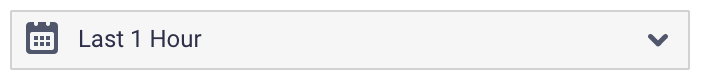 . It contains a list of the typical time/data selections, for example, last 1-12 hours, yesterday, last month. It also allows you to select a date/time range via a date picker.
A  indicates you can create or add, for example, create a new report or add an AutoAction.
Job status is frequently indicated by color, Killed ( ), Failed(
 ), Running (
 ), Success (
 ), Pending (
 ), Unknown (
 ), or Waiting (
 ). In tables (for instance, Jobs > Applications) the status is indicated as a bar on the left-hand side of the job's row. Other times it will be a glyph in a column with the status name noted inside the color.
Charts
Tables
Click
 on the right-hand side of the header row to select which columns to display. Click and de/select the columns you want to display.
When a column can be used to sort the table,
 is on the right-hand side of the header, click to use the column to sort the table. Click to sort the table on the column. Initially, the sort is in ascending order
 . Click the arrows to change the sort to descending order.
A
 glyph is in the insight's column when Unravel has insights for your apps.
A
 in the insights' column indicates there were alerts during the app's run. Hover over it to bring up a tooltip with the list of violations.